[fusion_builder_container hundred_percent=”yes” overflow=”visible”][fusion_builder_row][fusion_builder_column type=”1_1″ background_position=”left top” background_color=”” border_size=”” border_color=”” border_style=”solid” spacing=”yes” background_image=”” background_repeat=”no-repeat” padding=”” margin_top=”0px” margin_bottom=”0px” class=”” id=”” animation_type=”” animation_speed=”0.3″ animation_direction=”left” hide_on_mobile=”no” center_content=”no” min_height=”none”][Update: I posted a tutorial screencast that shows different population pyramids that can be created using Excel.]
Let me assure you that this is not a post on how to make your pies fly in PowerPoint. I am talking about the kind of animation that you can see in the famous Hans Rosling’s presentation in TED where you do learn something from the animated chart.
Animation is a difficult beast to tame (like color) but it has such a power for grabbing our attention that we can’t remove it from our tool set before further investigation. In an insightful paper on the subject (Tversky and Morrison, 2002: “Animation: Can it facilitate?“) the authors conclude that:
Interactivity may be the key to overcoming the drawbacks of animation as well as enhancing its advantages. If learners are in control of the speed of animation and can view and review, stop and start, zoom in and out, and change orientation of parts and wholes of the animation at will, then the problems of veridical perception can be alleviated. Participants can study those aspects of the animation that they need without suffering through portions they already understand. Then, carefully crafted animations can be apprehended, those that highlight the discrete and high-level steps and those that depict the analog and microsteps that animations seem well-suited to portray and convey. Like all good things, animation must be used with care.
When applied to changes in space or time, animation can reveal patterns that are difficult to see in static images. But you do have to have some level of interactivity, because if you don’t, you’ll only remember a very general pattern. Interaction will reveal subtle variations and micro-patterns that really helps you to understand the data.
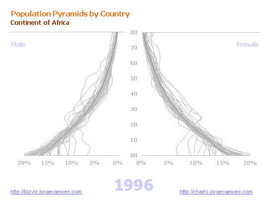
Let me show you a by-product of a project that I’ll share with you in the next post. As you can see in the image, I created a population pyramid with all countries in Africa. In this kind of chart you don’t need/want to identify the individual series. It shows patterns based on series profiles and, as you can see, the demographic profiles were (back in 1996) very similar. Now run a screencast that shows how the age structure in Africa changes between 1996 and 2050. Compared with 1996, 2050 shows a very different scenario.
I also recorded screencasts for the World, Europe, South America, North America, Asia and Oceania, as well as the more developed countries and the less developed countries. In each chart, a darker gray line displays the region profile. I didn’t implement it but you can use a different color for a group of countries and see how they change, using the remaining countries as context data.
I think this animation works because the changes in the data are slow and consistent. If you also have a very strong pattern with only a few outliers you could go without interactivity. But, as the screencast for Africa shows, diversity emerges and you’ll need/want to have more control over the data.
(The charts were created in Excel and there is a macro that changes the reference year, by that creating an animation effect.)
So, what do you think of animation as a visual tool? And of these “hairy” pyramids? Please share your thoughts in the comments.[/fusion_builder_column][/fusion_builder_row][/fusion_builder_container]
I appreciate the attempt to display the data in a more inclusive way. The “hairyness” helps to show the range of distrubutions on either side of the chart, and where the selected curves fit within the distributions, but unfortunately I find this “hairyness” makes it difficult to compare the left and right sides of the chart.
Jon
“makes it difficult to compare the left and right sides of the chart”
This is a problem with the traditional population pyramid, but for some reason the demographers love them… Probably they don’t need to compare both sides, since they are usually more or less symmetric. They love the idea of a pyramid, and its change over time towards a coffin-shaped chart…
When comparing males and females in a single population a one-sided pyramid with overlapping bars seems to be much better. I’ll try to get some feedback from demographers.
This is most comprehensive way of analysing the poulation……..
I show these hairy population pyramids to my 7th grade geography students. They found them interesting. They are a good teaching tool to go along with making regular pyramids by hand.