If you want to add animation to your charts that’s a clear sign that you have too much free time. Go out and play with the kids instead. 🙂
Yes, animation is a powerful attention-grabber, even more powerful than a glossy 3D pie chart in Crystal Xcelsius. And yes, it can actually be helpful (from time to time). But.
A good example of animation in data visualization is the famous Hans Rosling’s TED presentation, where a long-term pattern is clearly seen (at min 4:00):
This works well because the trend is easily identifiable and you don’t care much about the details. It would be much more difficult to make sense of this data if there were multiple trends and short-term variability. (More on the use of animated charts.)
After watching this presentation people often ask me: “Wow! Can we do that in Excel?” Wrong question. The right question would be “Wow! Can our data do that?”.
You can always create a simple animation in Excel, but it’s hard for a non-programmer to get a smooth transition effect. Here is an example from my dynamic Excel dashboard:
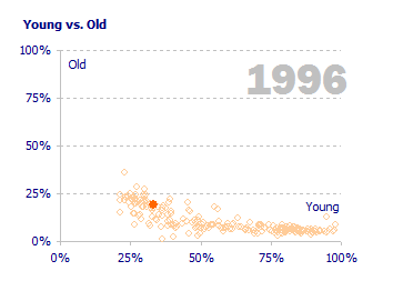
Although you can see a pattern emerging, you would need to add a complex interpolation routine to make it look better (read Jon’s post to see how a simple interpolation can be used).
Animation is better used if there is a pattern to be discovered, but you need something more: the ability to interact with the data. You must be able to stop, go back, get the details. While you can create a simple animation effect with a for/next loop in VBA, interaction with the chart is much easier using a Google spreadsheet with a motion chart:
(This is just an image. Click here to play with the chart.)

Dynamic Charts in Excel
In Excel, instead of creating a VBA routine, consider using a scroll bar linked to the value you want to change (year, for example):

Using a scroll bar adds some level of interaction because you can scroll back and forth, pause and examine the details for a specific year. Obviously, you need to change the chart data source dynamically.
Let’s recap how to create a dynamic chart in Excel. You can do it by changing values or by changing the data source itself (using a different range).
Option #1: Copying the Data

The range A1:E11 is our data set and we are comparing regions. Moving the scroll bar at the bottom changes the year. Column F is our data source. You can enter this formula there:
=OFFSET($A$1,ROW()-1,MATCH($A$13,$B$1:$E$1,0),1,1)
ROW() gets the current row and MATCH() returns the position of value 2002 (A13) in the range B1:E1. So, the formula in cell F2 reads something like this: start at A1, go down one row, go right three columns and get the data in that cell (range of width 1 and height 1). When the user selects a different year the data is copied to column F.
Option #2: Using a Dynamic Named Range
The second option is to create a dynamic named range. Create a named range and, instead of entering a fixed range, enter this formula:
=OFFSET(Sheet1!$A$1,1,MATCH(Sheet1!$A$13,Sheet1!$B$1:$E$1,0),10,1)
As you can see, it is very similar to the one above, but now the number of rows down is fixed (1) and it returns a range of 10×1 cells (because we have 10 regions, but if the number of regions varies you may use COUNTA(A:A)-1 to count the number of regions, excluding header – and don’t forget to move the year to a different cell…).
When you verify your range this is what you get:

You just need to use this range in your chart (when entering the range you must add the workbook name: “=Book1!SourceData”). You’ll also need a range for the category axis labels:
=OFFSET(Sheet1!$A$1,1,0,10,1)
You can download the spreadsheet here.
Take Aways
If you want to animate your charts make sure you do it because it adds value, not because you want to show off your skills. You can do it in Excel but it looks much better in Rosling’s Trendalyzer or in the Google spreadsheet gadget.
To create animations your data source must change dynamically, and that requires some work (and skills). I advise you to shift your focus from animation to interaction and use all that work to design a better user experience. Do you prefer a “wow!” (animation) or a “wow, thank you!” (interaction that actually helps the user)?
“After watching this presentation people often ask me: ‘Wow! Can we do that in Excel?’ Wrong question.”
Exactly. Our natural reaction is to want more glitz, forgetting that only certain types of data suit animation. Naturally, I’ve fallen into that trap myself. I would also be careful of over-interpolating, eg trying to create monthly figures from annual figures is probably overdoing it.
Jorge –
Animation is pretty cool, but it’s hard to do right, and its particularly complicated in Excel.
However, interactive charts are much easier even in Excel, and as you point out, they can be much more useful.
Hi Jorge,
I am less reluctant to recommend interactivity in Excel charts.
Of course, it is almost never required or expected. But it can add tremendous value and create hindsight. For instance, it’s always better to let user select or highlight series than to display many series on one chart with equal prominence, just because that’s how you’d do it in print.
I think that when you can do clear dashboards within the constraints of excel, and toss in animation in charts (all with good judgement and proportion of course) then you are fully entitled to bragging rights. and whether it looks better in motion chart… Not in all cases.