 Do you need VBA to create an Excel dashboard? Our recent discussion clearly shows two lines of thought: a) you should use it because there are things you just can’t do without VBA and if you have access to a powerful tool you should put it to work; b) you should avoid VBA like the plague because the average user don’t understand it and it can cause a serious problem if the programmer leaves the organization.
In an informal survey among friends and colleagues (all of them Excel users), I’ve discovered that 55% doesn’t know what VBA is, 40% knows but doesn’t want to use it, 4% uses recorded macros from time to time and 1% actually edits the recorded macros to add some sort of functionality (well, this happens to be me…).
The real world always depresses me…
The poll on the right seems to tell a better story, but you guys are le crème de la crème, so I can’t use you as a representative sample, I’m sorry…
The first version of my Demographic Dashboard uses some macros to synchronize pivot tables and to add some functionality to the user interface. Simple stuff, really. But there is a divide, and I had to know if I could create a VBA-free Demographic Dashboard.
That’s a the simple story behind the VBA-free Demographic Dashboard. This dashboard uses the same data set (population by sex, age and country for the period 1996-2050) and the final result is similar (that was the idea). But how can you achieve the same results without VBA? Just simplify, simplify, simplify. Let me give you some examples.
Dashboard objects
![]() Some times we use VBA out of laziness. Take a look at this object: I could place the background image on the sheet and use a few lines of code to correctly place the small triangle. That was my first idea. But why? Why don’t you just use a chart? It is simpler, safer and doesn’t require VBA. The final solution uses a simple scatter plot. Yes, I know, it doesn’t look like one. It’s amazing the things you can do with scatter plots.
Some times we use VBA out of laziness. Take a look at this object: I could place the background image on the sheet and use a few lines of code to correctly place the small triangle. That was my first idea. But why? Why don’t you just use a chart? It is simpler, safer and doesn’t require VBA. The final solution uses a simple scatter plot. Yes, I know, it doesn’t look like one. It’s amazing the things you can do with scatter plots.
 I already published a screencast on how to create a population pyramid, but this technique is missing. I wanted to recreate a popular chart format in magazines: lines to encode the current data and areas for the reference data.
I was unable to come up with an elegant solution using the standard available formats in Excel, so I had to improvise. This is a regular area chart, but I use the camera tool to rotate the image to achieve this effect.
Please note that you shouldn’t use this technique if you are planning to print your dashboard because of a well known bug in Excel (but there is also a workaround).
In the previous version of the dashboard I used lines in a scatter plot to display current and reference data. No need for the camera tool.

I really like this chart. It is amazing how it shows the aging process that currently affects every country in the world, specially if you can animate it to see how the passage of time changes the dependencies. As an European I find it really scary…
In this version, the active country is shown in the context of the active region and, unlike the previous version, it also shows the remaining countries, so the user can see the region in context.
I usually delete grid lines, but here they are almost invisible and they actually seem to help. Sometimes I forget that scatter plots are square by definition, but not in this case…
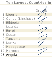 I don’t have a single post discussing sparklines, partially because I like to stick to things that everyone can do with a standard Excel installation (and you’ll usually need an add-in to create sparklines) and because there is so much to say about them that I wanted to write a complete series, and I don’t seem to find the time to do that. But you should definitively consider using them when planning a dashboard.
What you see on the left are not exactly sparklines, just a small line chart where each line is aligned with the country name. I kind of like these lines jumping out of their “natural borders” (the row limits and the table itself). Download the dashboard and compare these lines with the top ten countries in Europe, for example.
![]()
Lately I’ve been playing a little with links to external sources and I decided to add these two. The first one opens a Google Map with the active country and the second one opens the CIA Factbook for the same country. You don’t need to hard-code the links, it is just a string that is automatically changed whenever you change your data (in this case, the name of the country). You can also put the data into your worksheet, like I did when I created my Excel thematic map.

There is something that you can’t do without VBA. When you select a region, the list of countries automatically reflects that change, but the current country is not changed. A simple macro can easily select a new value when a different region is selected. So, you may be comparing Angola with countries in Europe (Angola is in Africa). Since I can’t change the default country, I added a conditional formatting for that cell, and when the country is not found in that region the background changes to warn the user.
Interested in the dashboard file.
Joel, just fill in the form and a link will be sent automatically.
looking to learn about creating dashboards in excel
Thanks for the info
An excellent file that has given me a handful of new ideas. Am already familiar with pivot – access database setup, and wanted to see how to go about a multi-funtional document for a varied group of customers. I may have a couple of Qs as I get into my own design. Thanks
Tony: Thanks for the feedback. I’ll try to answer.
The file was truly awesome. It will help me with new reporting system I am building.
I think what you’ve done is truly awesome! Is it possible to get a copy of the file for VBA free dashboard please? It’ll help me learn 🙂
Thanks a ton and have a good day!
I’d like to see a macro example on how to query SQL and update the dashboard
JJ: The VBA-free version excludes the use of macros. You must manually hit “refresh” to refresh the pivot table. Everything else is updated using formulas, specially the GETPIVOTDATA() function.
Nice work on the dashboard, but why are your line graphs not really sparklines? I know Office 2010 will have a new sparkline tool, but isn’t a sparkline just a small line chart?
The dashboard was made using Excel 2003 and I wanted to avoid add-ins, just to make sure every user replicate it with an out-of-the-box installation.
How obtain file example VBA-free Excel dashboard?
Thanks
Cristian: a VBA-free tutorial will be available soon.
Hi Jorge,
I am using excel for few year and has recently develop interest in excel dashboard. How to download your examples and is there any suggestion to learn core concept of developing them.
Regards and thank you for sharing your knowledge.
Zak
I’d love to look at your dashboard. I’ve never tried setting one up in that way. Interesting stuff.
Hi Jorge,
Nice work on the VBA excel free dashboard. Looking forward to learn more on this.
Is there a way to try software free, then migrate to $47 sign up fee?
Thanks,
Mike R
Looking to figure out how to create my own dashboards. I see there is a sample tutorial. Would you be able to send me a link to it?
Michael, Ed: Thanks for your interest. A tutorial with a trial period will be available soon.
Hi, cheers for your website.
I thankfully have recently found you and that your classes/tutorials make my life a lot smoother!!
I´d lke to say thank you, keep up the good job, and please, let me know if you´re writing other stuff.
I am in my way to finish a huge report to the company I work for – an enormous fixed phone company down here in Brazil.
More than just a report, this excel program I built is pretty much a managing software that will probably infuence big decisions.
You are a part of this, because I´m so attached to details when it comes to work – and your excel tips are just wonderful.