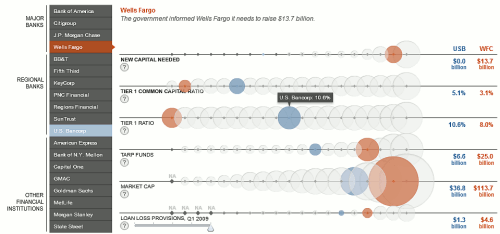
Nathan discusses this chart. He says:
I know a lot of you don’t like bubbles in your viz, but this one works for me.
Jon Peltier, in the comments, argues that:
Sets of bars would have been more effective.
Tim adds the definitive argument:
“Always using bar charts is like always using missionary position. It might be more practical, but it gets boring!”
OK, let’s see. I have nothing against bubbles, there is a good level of interaction, and the chart looks clean and professional.
And yet, something is missing. I like interactive charts, but I’m lazy. I love a chart that shares a story with me and invites me to touch and manipulate and find more and more. When you open this chart there is nothing interesting to see, and if you force it to speak, well, it just… bubbles.
Tim’s comment is fun, but not very accurate. I will not detail my own preferences regarding positions but, unlike data visualization, getting the job done quickly by maximizing efficiency is not exactly my number one priority.
You can/should be creative, but at some point you must decide if you want to know how far down the rabbit hole goes. If not, it’s just inconsequential foreplay. Nice, but not enough.
I have to agree with missionary Jon on this one…

“Always using bar charts is like always using missionary position. It might be more practical, but it gets boring!” – Not if you change parters a lot.
Junkcharts covered this in Supplemental Reading.
Not only do bubbles stink (re Eddie Murphy’s quip in “Trading Places”*) but the interaction in this chart was gratuitous and actually detracted from making meaningful comparisons, because only one bank’s information was visible at a time.
* The homeless Eddie Murphy was given a bubble bath by some wealthy individuals, and he said that the only way he ever had a bubble bath when he grew up was related to flatulence in the tub.