The French call it l’air du temps, the spirit of the times. You breathe it, you wear it, you eat it. You can’t escape it. Over the last 20 years, the spirit of our times gave us things like:
Glossy Pie Chart

McMansion

BMW X6
Jeremy Clarkson:
“The X6 was conceived at a time when we all thought the banks know what they were doing, but it went on sale moments after we discovered they didn’t. And I’m sorry but in a recession a car like this just looks ridiculous. [fusion_builder_container hundred_percent=”yes” overflow=”visible”][fusion_builder_row][fusion_builder_column type=”1_1″ background_position=”left top” background_color=”” border_size=”” border_color=”” border_style=”solid” spacing=”yes” background_image=”” background_repeat=”no-repeat” padding=”” margin_top=”0px” margin_bottom=”0px” class=”” id=”” animation_type=”” animation_speed=”0.3″ animation_direction=”left” hide_on_mobile=”no” center_content=”no” min_height=”none”][Like a skyscraper in Hong Kong, the X6] it’s not particularly beautiful, it’s not particularly useful. It was built by a world, for a world, that doesn’t really exist anymore.”
I could say the same thing about most of data visualization software…
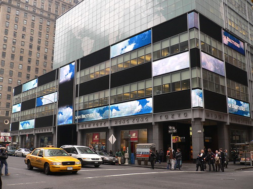
Lehman Brothers
So if you think that people love glossy 3D charts because they are ignorant and you can help them to see the light, well, think again. It’s more complicated than that. It must fit well into the system of values and beliefs or it will never be fully accepted.
People are irrational. People don’t pursuit their best interest. We buy useless stuff, we procrastinate, we like fast food, we fall in love with the wrong person. Why would we choose charts rationally? Let’s accept irrationality. Let’s embrace it. It is part of the data visualization equation, whether we like it or not. We need our behavioral economics.
Yes, it’s hard to prove that data visualization influences people. Yes, sometimes people prefer infotainment. But it’s more than that. When we blindly follow the positivist, purely rational path, what are we afraid of?
[/fusion_builder_column][/fusion_builder_row][/fusion_builder_container]
Jorge, thanks for this thought-provoking post.
I train people in financial & business modelling, & I’m always banging on about how charts should be simple, austere, minimalist etc.
Of course you’re right; most people like a bit of glamor – and some chart gloss adds that sizzle to the steak.
So if you spend all day being assailed by glossy advertising messages, what are you more likely to be ‘sold’ by: a monochrome, dour line chart or a fully pimped, multi-dimensional, drop-shadowed work of chart-art ?