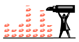
 Making a chart is so simple that even a chimpanzee can be trained to do it – press F11 and get the banana (that would explain the poor quality of many business charts and presentations – and the raising banana consumption).
To prove that they are better than chimpanzees at making charts, humans invented the eye-candy and its epitome, the glossy 3D pie. Some well-known data visualization experts believe they are poor and useless, nothing more than lipstick (on a pig?).
A don’t agree. A think they are rich and very informative: there is no better chart to tell us that the author hasn’t the slightest idea of what to do with the data. (I am sure there is a strong inverse correlation between 3D pie charts and scatter plots. The more you love one, the more you hate the other.)
This is not just another rant about 3D pie charts. It’s about charts in general, even the good ones. If your only data analysis / communication strategy is to pollute the air with yet another chart then you are fully immersed in the sissy world, and lipstick is all over the place. Charts can help reduce information overload, but chart overload is not better.
A chart is just one of several tools you can use to make sense of your data. You need text, and plain figures, and statistical measures, and tables and yes, some charts. The best results come from the right blend of all those tools.
How do you know if you are a sissy (chart-wise)? Here is a simple clue: if you know how to use and interpret a box-and-whisker plot then you’re on the right track (extra points if you can do it in Excel). If not, do yourself a favor and find a good entry-level statistics manual.
All well enough for you Jorge but, when your Managing Director asks you to build a 3-d pie for his next shareholder presentation, telling him that he “hasn’t the slightest idea of what to do with the data” may be a career limiting move.
My advice would be – if you have to build a pie chart, make sure its a good pie chart.
http://www.cockeyed.com/inside/nuts/nuts.html
Ed: Well, we all have to deal with them, don’t we?
(Note to self: write a post on “guerrilla charting”)
Jorge,
I totally agree with your view on this topic. People in their vast majority do not questions themselves enough before creating a graph. In some circumstances a simple set of figures works best.
I ran a similar grunt recently following an interview I had with a French newspaper – where the graph I built for a given example was discarded as it was not “traditional ones” (ie: line, histograms or pie chart…). People generally never stop and ask themselves “Do I really need a graph? If Yes, which one ?”.
In my opinion, the trouble we are facing is that people are trapped in a particular mindset regarding graphing data. This mindset is the consequence of the following elements:
– Constant exposure to a limited library of graphics: low quality of defaults-charting options in whatever system they are using + mass production of those “standard graphs” in day-to-day media exposure (Press, TV, Internet, as well as enterprise-based presentations and reports)
– Simplicity of creating a graph that shortcuts the necessary data-preparation work (data quality, data order, choice of graph based on pre-defined communication objectives or analysis results)
– Near zero level of awareness of the importance of “When and Why” use graphs (and how to build efficient ones) during educational / academic years before graduation.
What I found particularly sad is that people are generally not aware of the precious time lost in trying to figure out a bad graph. Imagine at a Company Board level, 12 CxOs individuals loosing 5mn each trying to figure out what is the reality behind glossy charts… That’s a whole hour lost and when you compute in their hourly rate… well the maths will not likely prove that this glossy chart yields on strong return on investment…
That time could be better spent in actually making decisions and implementing them. As you stated, endemic chart overload is no good contribution to progress.. And to counter this will require long-term evangelization efforts…
I’ll go you one better – if you know how to use a density plot because box-and-whisker plots break down with multi-modal distributions, then you’re on the right track. 😉
But boxplots in Excel are a thankless task – unless Microsoft has finally built them in.
Haha! I get a point! I just finished plotting 22 points of data on 2 box and whisker plots in Excel. I totally agree with Ed on how tiring making a box plot can be. I spent almost all of my time working on my science project today trying to find a good tutorial, then figuring out and reproducing my own plot using said tutorial. I got halfway through making plots from about five different tutorials before i would get to step twenty-bajillion, where it would not work. FINALLY found one. But I’m glad I took the time to make it because a box and whisker plot is what I really needed to represent my data.
ps: Rachel 1 : Monkeys 0