 How do you sell your outrageously expensive consulting services? Simple, just add a chart…
Not every chart will do, of course. Let me outline some basic design rules of what I call a “consulting chart”:
- It shouldn’t be recognizable as a standard chart that you could create in Excel;
- It shouldn’t use popular eye-catching design elements, like 3D or textures (hire a designer if you really want those);
- It should convey an impression of complexity but make everyone feel smart because they could actually understand it;
Conventional visualization rules do not apply to this kind of charts. It lays between a proper chart and an icon or a logo. Always remember that your report may be 300 hundred pages thick, but only this chart will be shared in internal presentations, and the managers (your clients) should be proud of presenting it (money well spent).
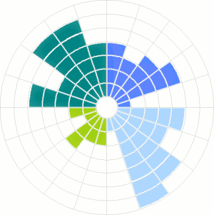
If you don’t feel creative today, just use the chart above. Every consultant likes it. A circular chart or a radar variant is always a good bet. Each color represents a dimension, and there is a set of five indicators for each dimension. A seven-point scale is used to measure each indicator.
As an example, a dimension could be “Human Resources”, and “turnover” one of the indicators. Display two of these charts side by side to compare “We” vs. “Them” or “Today” vs “Tomorrow”.
Here is a dilemma…
Strictly speaking, a simple bar chart would do a much more efficient job at displaying the data and letting the users compare multiple series.
But let’s be completely honest here. You know your client, and you know he will happily spend 12,000 for a report with these charts. If you use a regular bar chart you can’t ask for more than 10,000. What would you do? Share your thoughts in the comments.
Jorge –
That’s a simple Excel donut chart. Want me to build you a template? It’ll cost, let’s see, 12,000-10,000…. (assume these are Euros?) 2000 Euros per usage.
Mention my blog and I’ll give you the discounted price of 1500 Euros.
He he he.
Jon, Jon… This is a chart created with a unique technology you can find nowhere else, and it is one of our award-winning visualization tool specifically crafted to add value to our world-class business consulting methodologies.
Yes. It’s a donut. But the client doesn’t know.
you do have a point here, people are a lot more blown away by pretty pictures than by you making him 1000 dollars in a day.
people are in a way stupid that way…
good article 🙂
Thank you for this chart. It is really easy to develop such template in Excel (2 hours and I have pretty flexible solution). Well, it is a simple donut chart, but the idea of such usage is highly innovative.
I really appreciate any similar articles in the future.
Excellent piece Jorge! I’ve referenced in a rant about personality testing.
Scott Adam’s Dilbert would agree. Check out his strip on the overwhelming power of charts and graphs 😉
http://cli.gs/GbYrDu
Back in the 80s – I was working with Bell Northern Research, on product development. Lots of big brains with PhDs who looked askance at young, blond fluffy me from marketing.
My motto became “pie or die.” If I could put whatever it was into a chart (preferably with multiple colors and 3D components) – they’d all nod sagely and we got along swimmingly.
Great post
This is also a little contagion that has infected the minds of market researchers. Prettier the graph, the harder the work obviously… Throw in a couple of vox pops and you’re away!
*groan*
Chris
@CCSavage
With software interfaces, we are reminded that we should not force the user to think. Well, reports have users. Information design is about making the use of information something that doesn’t require a massive struggle for the user. You cut to the bone, you organize, and bam! The answer is right there. You don’t want the user to flip from page 4 to page 17 and scribble down things along the way. Nope! This use. That answer. Focus over generic. Focus is fitness.
Reports have readers. Reports have skimmers. Reports have users who would rather not. Reports have users who would rather listen to the executive summary on an audio podcast, or watch the video podcast. Reports have users that would rather another user to summarized it for them. That summary could be an iconic graphic.
That brings us to this post. Thanks!
Nice. Donuts are out – too many carbs. Its a bagel. They’re healthier.
I am a consultant and my only dilemma is to find out how to create this chart! I LOVE it and I have the PERFECT use for it. How can I find out how to create it? Thank you!
@Deanna: well, you are not the first reader asking how to create this. I guess I’ll have to write a post about it.
I am a little obsessed with this chart….I thought I better follow-up and let you know how I plan on using it—in case my plan won’t work w/ that chart.
Below is the component of the chart and how I’d like to use it.
• 4 colors – represents 4 different categories of questions.
• Each column – represents a question. There would be 5 questions per category with a total of 20 questions.
• Each ring – represents what number on a 1-10 scale was selected. There would be a total of 10 rings. “1” is the closest ring to the center and 10 is the outer-most ring.
I am not sure how to format the Excel and which type of chart to use? Donut? Radar? I only know enough to make me dangerous!
I look forward to your post! Many Thanks! Deanna 🙂
It is a creative chart! But I can’t understand well about it and how to make it by EXCEL.
In my opinion, of course,I will use the chart and do not use bar chart! It seems so unique and clients may think that it is really a professional chart and values 12,000.
I am your honest reader from China, and learnt much from your blog. Thanks very much.
This fine knowledge sharing. Tomas, you are working for the common good, which is very good. unfortunately it is not the usual practice among consultants in our sector however should be. Nils
Hey Jorge!
Did the post about how to do this chart come out?
Cound’t find it and I am very interested about how to do it.
Tried hard, but with no success!
Tks!
Found it!
http://www.youtube.com/watch?v=9U1RzHzCDWE&feature=player_embedded
https://www.excelcharts.com/the-consultants-chart-revisited/