Every chart starts with a table. We transcribe this table into a visual representation of distances between data points: the “origin chart”. That’s when our “eye-brain system” starts making assumptions. It assumes that data points are somewhat related, even if they are not:
These are (pseudo) randomly generated data points, but even knowing that, we still try to find something that makes sense. Stare at the image for a while: you start to see a fish, a cow head… and you end up with your own constellations, as good as the traditional ones:

Our eye-brain system makes constellations all the time: grouping data points and finding/assigning meaning. With abstract data we have to make sure that the grouping process follows some rules, like not grouping data points belonging to different time series:
The dots above are our origin chart. Then we force grouping by color and reinforce it with lines. This seems obvious, but let’s see why it happens and how we can take advantage of it when making charts.
It’s in our nature to simplify things to reduce the cognitive effort to process them. Do you see this circle?
I see it too, but it’s not a circle… It’s a set of dashes that we connect to make a circle, because that’s a much simpler shape (try to describe this shape without connecting the dashes: it’s harder than you think).
I’m sure you remember Gestalt Laws from high school: “the whole is greater than the sum of its parts”. “Gestalt” means “pattern” in German, and these laws tell us how we group things we see. Yes, it’s grouping, but grouping with the purpose. That purpose is pragnanz or good form: we like ordered, simple, symmetrical, closed forms that are easier to process.
But how does this principle of pragnanz actually work? Let’s take a look at the laws and see how they apply to data visualization.
Gestalt Law of Proximity
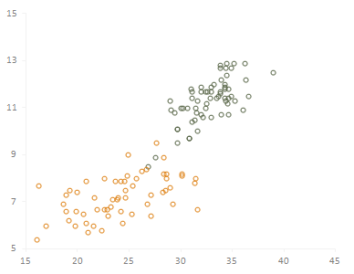
When reading a scatter plot, we tend to group data points that seem near each other and assume they share similar characteristics (it’s like Tobler’s first law of geography: “everything is related to everything else, but near things are more related than distant things.”). In the scatter plot below we can easily define two groups:
Gestalt Law of Similarity
When we use different colors to identify series in a chart we are applying the law of similarity: we group together things that share the same color, shape, direction. Let’s redraw the scatter plot above:
I didn’t tell you, but each data point represents a county, and color encodes the state. As we can see, there is virtually no overlap: each of the two states have a very distinctive profile.
Let’s see a new example. Compare color selection in these two pie charts:
You can improve reading with a simple trick: use color to group slices and use different shades to identify each slice. The pie on the right is richer: the reader can analyse each slice per se, but s/he’s also encouraged to compare the orange group as a whole to the blue group.
Gestalt Law of Connectedness
According to the law of connectedness, connected data points are perceived as belonging to the same group:

It’s interesting to note that, while the law of similarity groups data points by color, the dark ones seem loosely defined as a group, when compared to the orange ones.
Gestalt Law of Continuity
There are some missing values in this series. The law of continuity will tell you to close the gap using a simple and smooth line:
But this is how the real series look like:
This is something you should be very careful about. These processes take place and we often are unaware of them, and jump to conclusions that are not supported by the data (or the missing data, in this case…).
Gestalt Law of Closure
According to the law of closure, we close objects using simple constructs and see everything inside as belonging to the same group. The chart below illustrates these two concepts:
Although there is no frame around the chart, the (very) subtle axis lines and the labels are enough to define a closed space. Everything inside belongs to the entity “chart”.
The same principle applies when you draw a border around data points or change their background color. This is a very powerful principle. The chart above applies proximity, similarity and closure laws, but the first groups we see are based on closure. See the group in the middle? It doesn’t make much sense, does it? And still, we accept it, because there is a border around it…
Gestalt Law of Symmetry
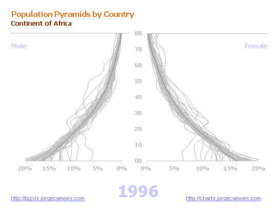
When we make a population pyramid we plot male population data to the left (negative x values) and female population data to the right. This creates a pyramid-like shape, stronger than two separate charts.

Although not much used, we can take advantage of symmetry when designing a dashboard, making before/after comparisons, etc.
Gestalt Law of Common Fate
The law of common fate applies specially to moving objects. Data points in an animated chart are seen as a group if they move together:

Hans Rosling’s Trendalyzer takes advantage of this law, as we all saw in his famous TED presentation.
The law of common fate also applies to line charts: those series that seem to be heading in the same direction are grouped together.
It’s not just about data points
These examples use data points to illustrate Gestalt laws, but it goes beyond that, obviously. Imagine that you create a chart and scatter the legend all around. It doesn’t make sense, does it? The moment we put the keys near each other we see that this is a meaningful group. A frame around the group reinforces that feeling, but you don’t really need it, do you? We often take an unnecessary belt-and-braces approach.
The same applies when you make a dashboard or other multiple-chart representations. If you use a light gray for a background, the reader will know that the charts are related and adjusts his/her reading accordingly.
Takeaways
- We are constantly grouping objects based on color, shape, direction, proximity, closure/enclosure;
- We like simple, close, smooth, symmetrical, easy-to-process shapes;
- If we are aware of these laws we can take advantage of them to design better charts or dashboards.
- We must also be aware their negative impact: we shouldn’t force the reader to see groups that aren’t really there; a simple shape is not necessarily the right shape.
Further reading
- Stephen Few: Show Me the Numbers
Chapter 6
- Colin Ware: Information Visualization: Perception for Design, Chapter 6
We can’t be serious about data visualization (even if we don’t want to be experts) without paying attention to how perception works and, in this case, the role of Gestalt laws. Do you agree?
__________
I’m writing these pages to create a consistent approach to data visualization for Excel users. You can navigate this series using the links on the right.
If you like this page please share it using the buttons below. And don’t forget to follow me on Twitter!
[/fusion_builder_column][/fusion_builder_row][/fusion_builder_container]


Hi Jorge – great post, thanks! 100% agree – “Paying attention to how perception works” is all about respect for the reader. Understanding principles like these is helpful, and I’d add that getting feedback from readers before publishing can also be helpful. I’ve learned a lot by asking & watching what people see and noticing what they don’t see or what confuses them. Maybe principles get you in the ballpark, and feedback gets you home.
Nice blending of math and psychology.
Great post Jorge !!! Loved it so much!
Great job. I always liked the application of Gestalt laws and think that everybody who writes reports should read about them. Then you will know what perception will tell the reader.
Hi Jorge. Loved the post. I presented Gestalt laws in my book on the Art of Presentation as guidelines to follow to create great visuals. You present a refreshing insight on their importance to graphs. Can’t wait for the next Chapter. How will the overall book be published : hardcover, eBook, PDF ?
Thanks Bernard. Above all I want to find my own voice: write down what I think I know about data visualization in a consistent way (and not just a bunch of random blog posts) and get feedback from the readers. I think this can really help everyone. Then I’ll decide if it makes sense to publish it in book form. Probably there will be an ebook version.
Good post Jorge – thanks for keeping the coming! Gestalt principles are generally at the heart of all good design. Concidentally, I just read Stephen Few’s blog post on the principles for good design as formulated by designer and “Gestalt Engineer” Dieter Rams. Highly recommended. http://www.perceptualedge.com/blog/?p=1138.
Hi Jorge
It is ok to be random, once in a while, as I am in my blog. Have you read Paulo Coehlo’s The Alchemist, a novel in a “consistent” narrative form. A great book if you have not read it before. He has also written a collection of short stories, Like the Flowing River. Also a wonderful book with thoughts and reflections. Random and “inconsistent”. Both forms have a place and a reader can gain insights from either formats.
Something you may like to read jorge – http://paulocoelhoblog.com/2009/04/16/the-pianist-in-the-shopping-center-part-1/ and http://paulocoelhoblog.com/2009/04/17/the-pianist-in-the-shopping-center-part-2/ just one note in a medley !
Paresh: there is nothing wrong with random posts. I just feel the need for some kind of framework to make sense of the overall structure. I’m sure I’ll be able to formulate how I see information visualization in the back of a napkin, but first I need to write the book!
Under ‘Gestalt Law of Closure’ you show a chart that not only shows the principle of Closure, but also of Enclosure. That is, drawing a border around a set of visual elements. I believe it would be correct to refrase one of your statement to: ‘but the first groups we see are based on enclosure’
Jorge, thanks for this post! I agree with you on needing my information structured before I can do anything with it! I tend to group anything before I start a project. I have learned from working with others and in my home life I am a very field dependent person.